Company: Mirror
Role: UI/UX Designer, Researcher
Duration: 1 month
Medium: Figma, Adobe Suite, Optimal Workshop
Mirror is a global chain clothing store. The store has various styles for any occasion at an affordable price. Over 400 stores around the world in 32 countries, shoppers have approved of their in-person exceptional customer service in person. Mirror wants to create an online responsive e-Commerce website that makes online shopping for new clients and retains members as hospitable as possible right from their devices.
Problem
Mirror stores are successful offline, there is remaining inventory in their warehouses. In addition, customers have asked for options to shop online and in-person experience. The company is looking to redesign its logo and gain more customers with an online shopping website.
Solution
I intend to create a logo that will attract new audiences and familiarize existing customers. The responsive e-commerce website will allow users to have a quick and hospitable shopping service. The browsing experience should let users view all products and filter their preferences without broken links. Creating an online site would boost sales and provide customers not near a Mirror store an outlet to shop freely.
My Approach

Research
Discover Behaviors
The company believes clothing doesn’t have to be expensive and last forever--that we should be able to change styles as we need and please. Mirror didn’t invest in any digital platform due to keeping the service in person. However, customers have been asking for an online site for years, citing its convenience and arguing that if they can’t find their size in the shop, they will end up ordering online from other stores. Mirror has also acknowledged that they have plenty of remaining inventory in their warehouses that are very difficult to move if only a few pieces are left.
Research Goals
Engage with users
In order to relate with shoppers, I set up interviews with users who had experience with shopping websites and plan on buying a product. I started gathering a group of people between the ages of 15 — 70+. The approach to my user findings was collected by applying a combination of these methodologies,
Compare to Competition
Competitive analysis is one of the methodologies used to conduct my findings. I have conduct research on direct and indirect companies of Mirror’s competitor to identify the strengths and weaknesses. Through the user interviews, companies such as Forever21 , Gap, Old Navy & H&M are direct competitors. These companies offers shopper affordable pricing on products. The indirect competitors offer high quality material at premium price & limited promotion deals. Some of the feature I explored:
Filter/ search usability
Overall site's visual interface
Navigation accessibility
Many of the websites provide user search /filter options. Some inventory availability was not updated and the lead listing was not found. Based on this competitive analysis, I will be able to reduce Mirror’s weaknesses and reinforce its strengths.
Direct Competitors
Indirect Competitors

Research Findings
From my user interviews, many were able to identify their concern with clothing eCommerce websites. While plenty of websites do provide as much information as necessary but there are still aspects users find themselves jumping over hurdles.
Strategize
Empathy — Ability to understand
From the interview findings, I created personas based on the archetype — “Young Thrifty” a combination of young professionals/ Thrifty / Frugal. Based on the user’s demographics and background, this will better empathize with the primary user that would be interested in online shopping. In addition, I created a storyboard of Sade’s motivation to shop for a new wardrobe.
Provisional Personas
Defining goals
To align research findings with the company’s defined goals, I was able to dart the happy medium of business, User, and technical groups.
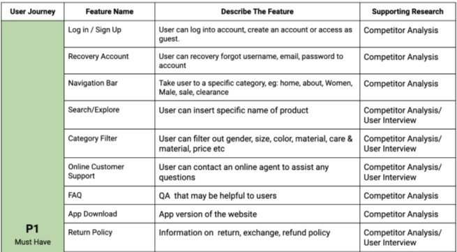
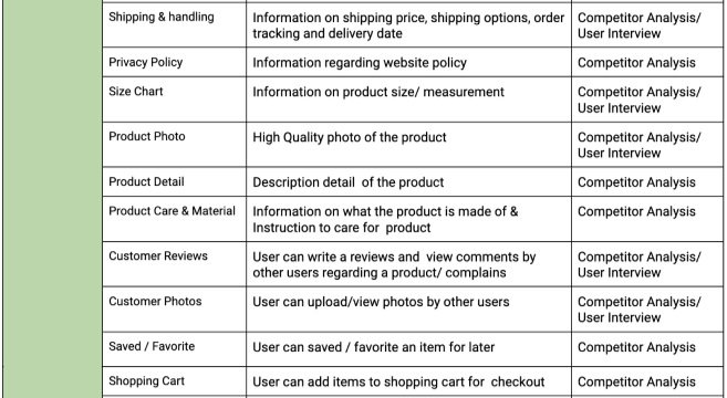
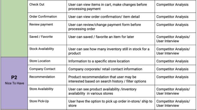
Feature Roadmap
As I begin to strategize essential features based on the research collected and , prioritized into 4-categorized, P1 being the highest & P4 as the lowest

Information Architecture
Mirror will launch a wide range of products for all gender preferences - From New Arrivals to seasonal sales. The navigation category will carry various of items - clothes shoes, bags, accessories, travel & home. How would users go about filtering/searching through the listings? How can I organize the categories to provide users with the best customer service and less search load time?
Card Sorting
Recruit participants to conduct an open card sorting exercise. This exercise was performed remotely among my network of friends. After listing optional questionaries, marking cards, and task categories, the study was launched.
Individual Sorting
Participants - Total 7. 4 Female | 3 Male
Tools - Optimal Workshop
Duration - 15 Minutes
Sorting Rounds - 1 round
Result Finding
Participants have sort categories based on lifestyle preference, season-appropriate wardrobe, and upcoming occasions (getaways)
Sitemap
The sitemap shows primary navigation that is linked to secondary single or multiple pages. The draft will keep designing features structured & organized

Take A Stroll — User Flow
Follow the Users path
Coming up with a scenario based on my participants & personas, I draft the Task Flow & User Flow diagram revealing the path users could take in their shopping experience. The diagram shows the user’s thought process as he will make decisions and actions to complete their journey.
Creating a scenario
Jonathan is looking to purchase a t-shirt. He goes to explore the website to shop for a T-shirt & proceeds to checkout as a guest instead of creating an account.
Their Journey — Task Flow
Creating a scenario
Jonathan hasn’t played volleyball in a while and wants to start again but he doesn’t have any plain shirts. He goes to explore the website to shop for a T-shirt & created an account to proceed to check out.
Ideation
Brainstorm ideas
I mapped out some of the features that would be on the desktop & mobile versions. My thought process — How will the user navigate through the site? What information should be included for fast & easy shopping? As I write down the functions, I have to consider if these features can be developed in a high-fidelity prototype.

Wireframe
This low-fidelity version will refine my ideas — To think about what necessary pages should be featured for users to navigate through the site.
Mobile App Pages
Homepage
Product Listing
Product detail
Checkout
Create An account
Sign in
Mobile App Pages
Homepage
Product Listing
Product detail
Checkout
Create An account
Sign in
Filter option
Branding Style Tile & UI KIT
The branding style tile & UI KIT was inspired by nature's earthy color and travel destination that makes people feel cozy. The design approach is to use high-resolution imagery. Let user imagine their favorite place in the world, wearing clothes that are suitable for any occasion.

Device
Desktop - Macbook Pro 16in
Mobile - iPhone 13 Pro Max
PROTOTYPE
I designed a high-fidelity prototype using Figma. I had to create 6 additional pages to polish my initial wireframe.
During this phase, 6 participants were recruited from my network for user—testing. The participants were given a list of tasks to complete as they navigate through both the desktop & mobile app.
Participants - Total 6
Gender: 4 Female | 2 Male
Age: 21-35 years old
Usability Test
Affinity Map
5/6 users completed the task. Due to internet complications, one user could not load the prototype in a timely manner. Based on the usability testing feedback, the affinity map will assist on refining my design.

Refine
Based on the feedback from usability testing, I was able to get a better understanding of my site. I went back to my design lab — to tackle the necessary problems with the first prototype
Refine the following — Desktop & Mobile
Font size — Apply smaller font to all the pages
Fill in white space — reorganize imagery & text to fill in gaps
Resize images — Make imagery smaller to take up less screen space
Redesign forms — Required less information to sign-up & Check Out
Redesign process bar, buttons, and bubble selections
Improve filter usability
Create an Account Form
The form took up an entire screen on desktop/ mobile. this causes the user to scroll endlessly. In addition, the forms required* information that wasn’t necessary. I have removed irrelevant information requirements & resized —the font, form & buttons to fit the screens for less scrolling.
Desktop
Mobile
Progress Indicator
I redesign the progression bar with bubbles to indicate t user’s current stage of filling out form.
Product Listing Row
The initial version have 3 products per row, and the titles and images were too small — I rearranged 2 products per row and increase the font sizes.
Mobile
What’s Next?
• Add more features to increase engagement
• Iterations on filter search options
• Integrating a live-chat system
What did I learn?
• Keep asking why for each step and focus on the problem and process.
• The importance of task flow and all types of wireframes
• Be open-minded and flexible to trade-offs at any time


